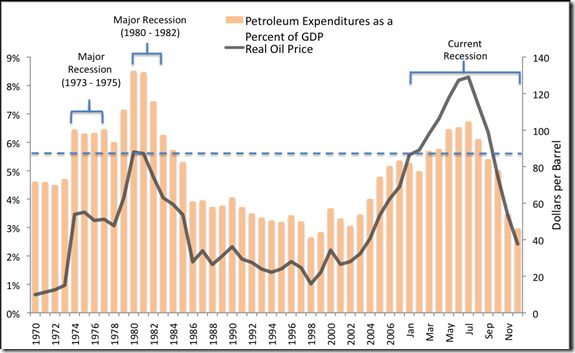
I was reading another POV on peak oil and found this graph in the discussion which I thought was well presented. You can find the article – which feels like a relatively even handed “peakist” view – here: Time and the Latest CERA Report. The actual article where this chart originated is more specifically geared to the relationship oil price has with recessions and can be found here: Further Evidence of the Influence of Energy on the US Economy. In this latter article, take a look at the comments from some not so moderate “peakists.”
8 years ago

0 comments:
Post a Comment